Digital Paper
Web Application
2023
ncloud solutions
Insure Tech
6 Weeks
Senior Product Designer
Project info
Scope
The goal of the project is to design and develop a modern, user-friendly digital paper management portal that streamlines document organization, storage, retrieval, and collaboration. The portal will cater to both individuals and businesses, offering robust features such as secure document storage, version control, and seamless collaboration tools.
Process
I researched, analyzed, and gathered insights to redesign a digital papers management portal. I ideated, sketched, and created high-fidelity designs that cater to a modern, intuitive user experience. User testing was conducted to gather feedback, ensuring the design aligned with user needs.
Solution
The digital paper management portal will offer a comprehensive solution for managing documents in a seamless, secure, and efficient way. Through advanced document handling capabilities, real-time collaboration tools, and robust security measures, this solution will empower businesses and individuals to manage digital paperwork with ease.
Road Map
The UX roadmap outlines the key milestones and phases involved in designing a seamless and user-centered digital paper management portal. This roadmap ensures the user experience evolves through continuous feedback, testing, and iteration.
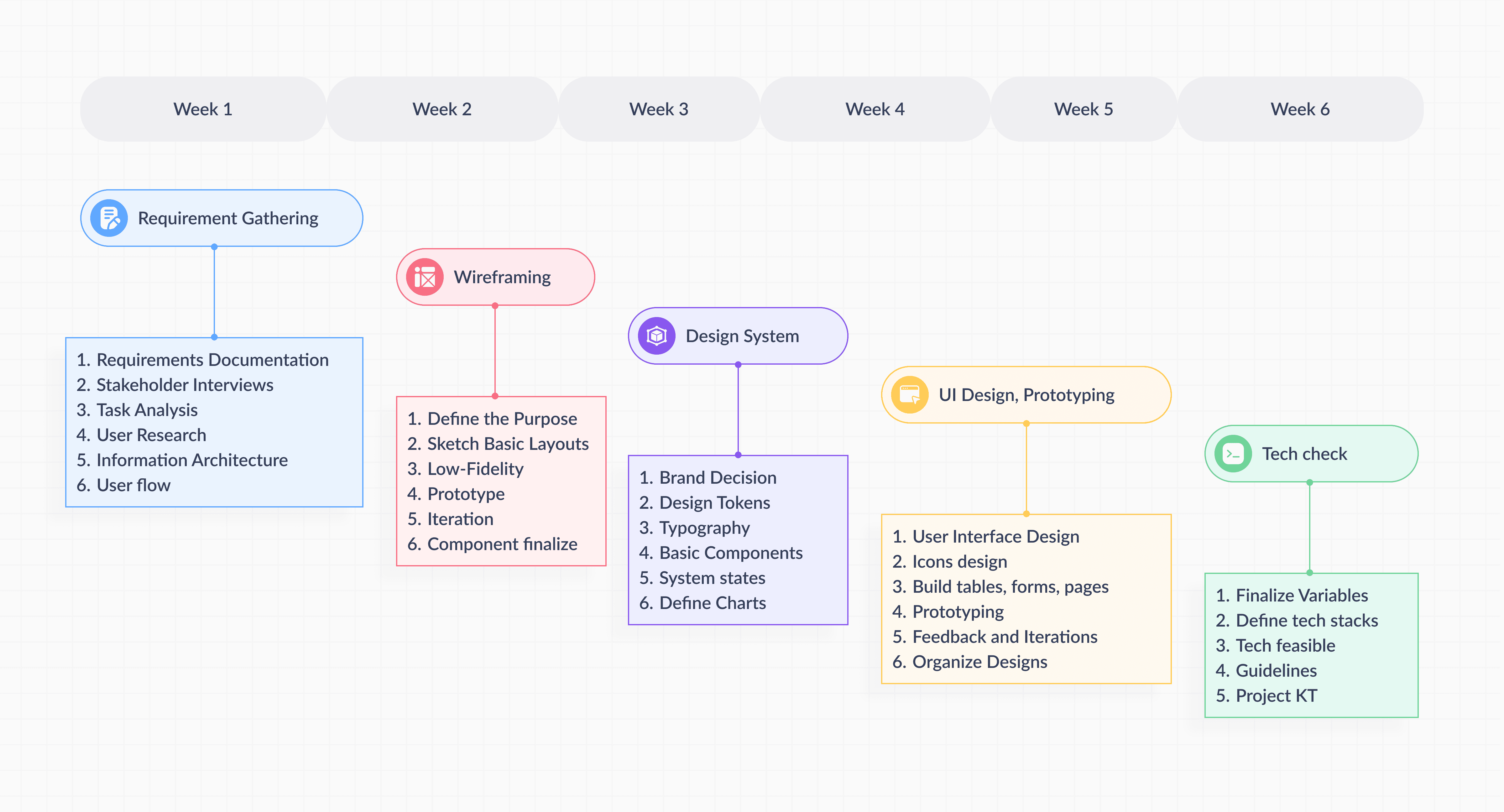
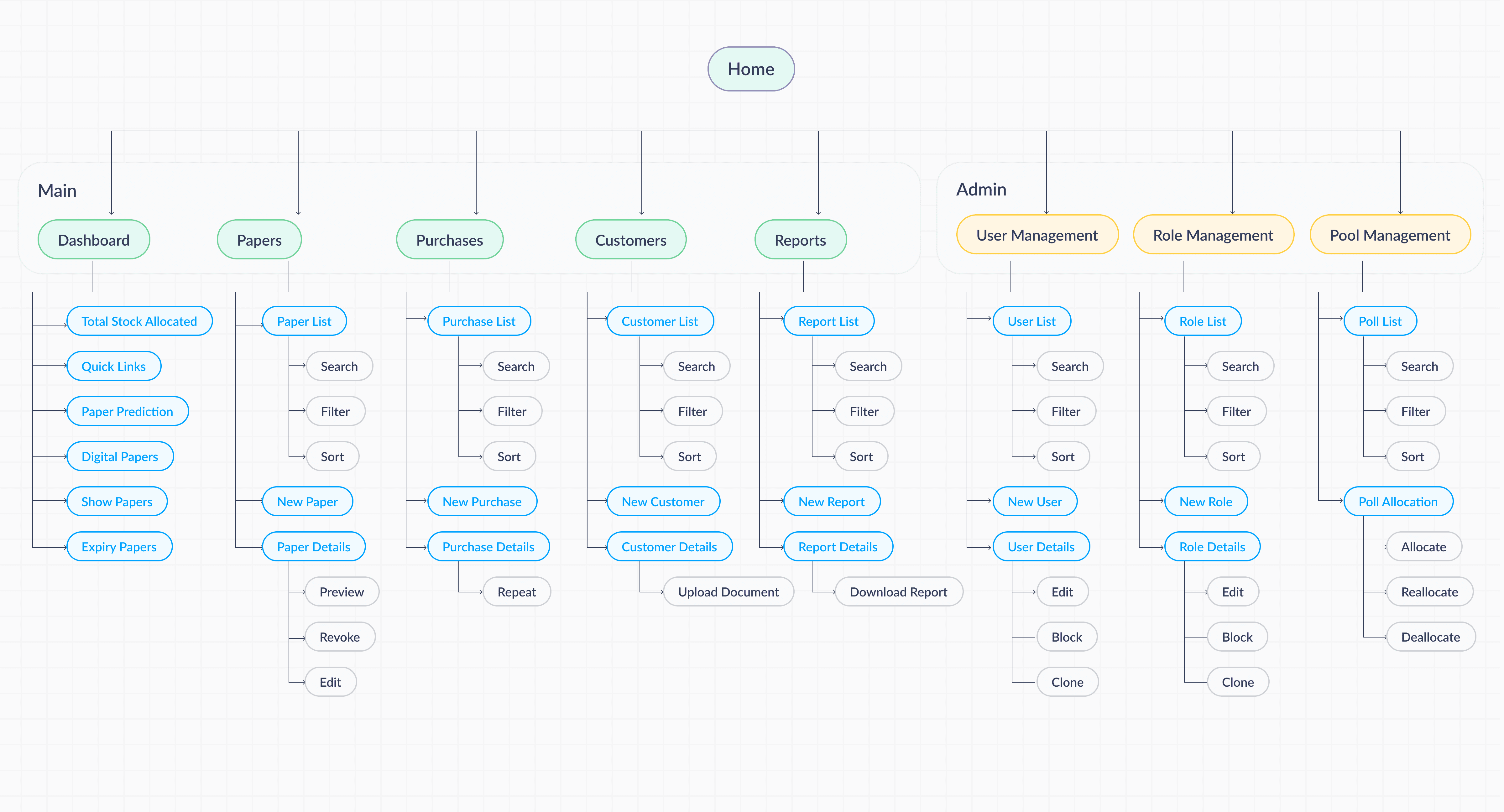
Information Architecture
Define the structure and navigation of the portal, ensuring users can easily find and manage documents.
Wireframes
Wireframes and IA to validate the basic structure and flow before advancing to detailed design.
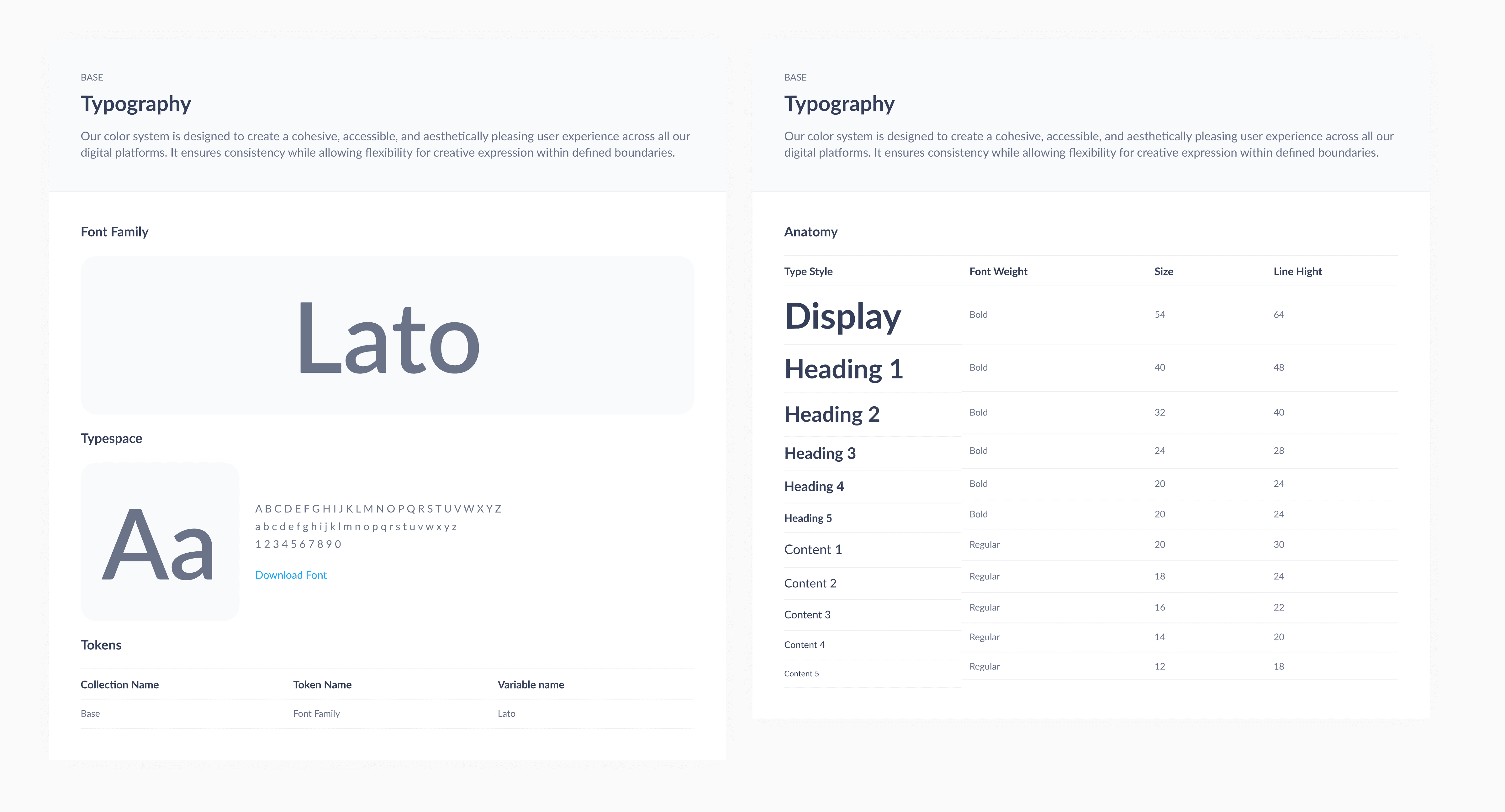
Typography
Lato is a sans-serif typeface designed by Łukasz Dziedzic in 2010. It is known for its clean, modern appearance with a warm, approachable feel, making it highly versatile for both professional and casual use.
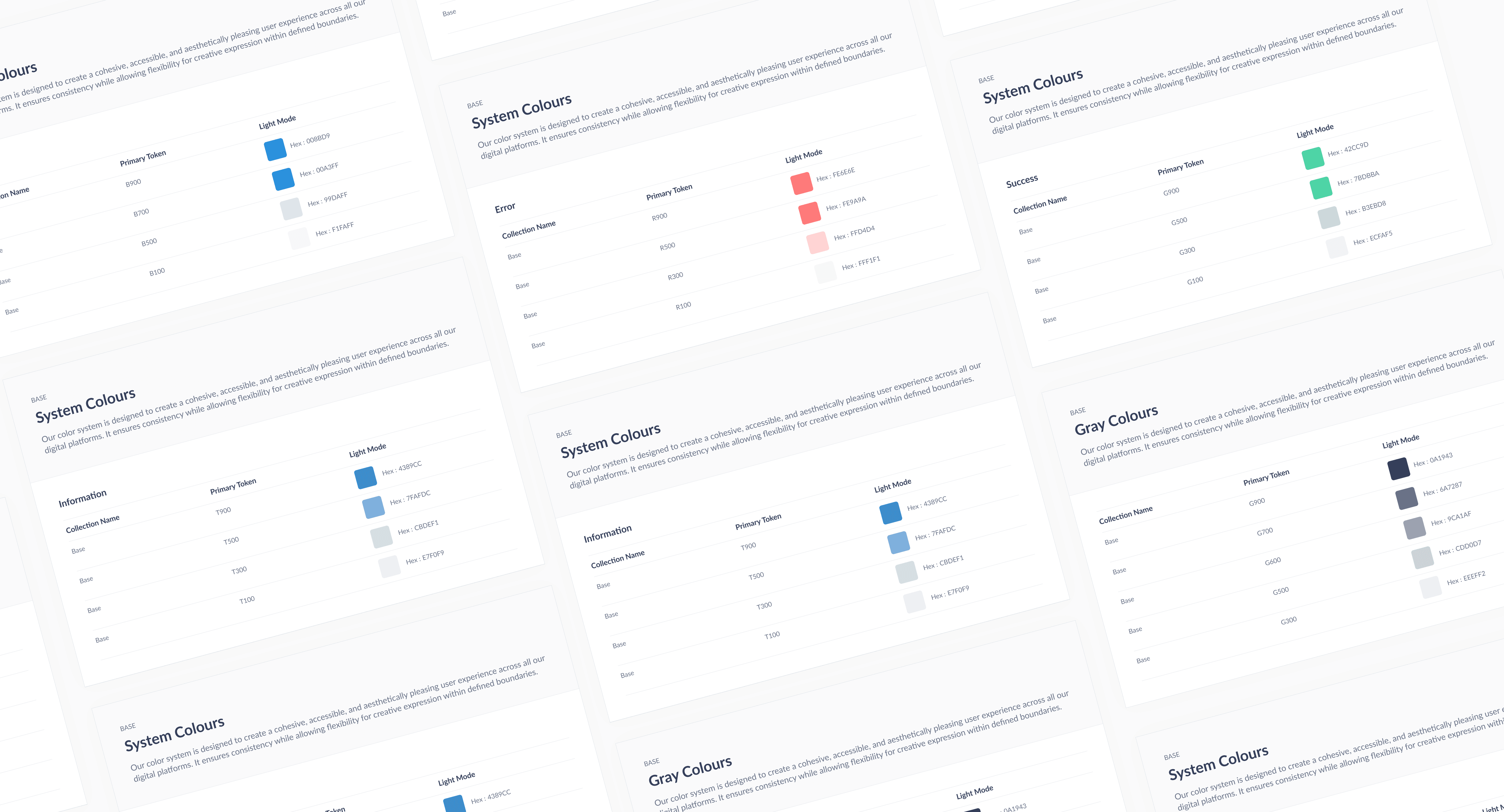
Design Tokens
Design tokens for colors are a set of named variables that represent specific color values used across a design system. They ensure consistency and scalability by allowing colors to be centrally managed and easily applied across different components and platforms.
Components
Reusable components in a design system are pre-built, standardized UI elements that can be used across different parts of a product or application. These components are designed to be flexible and adaptable, ensuring consistency in both design and functionality.
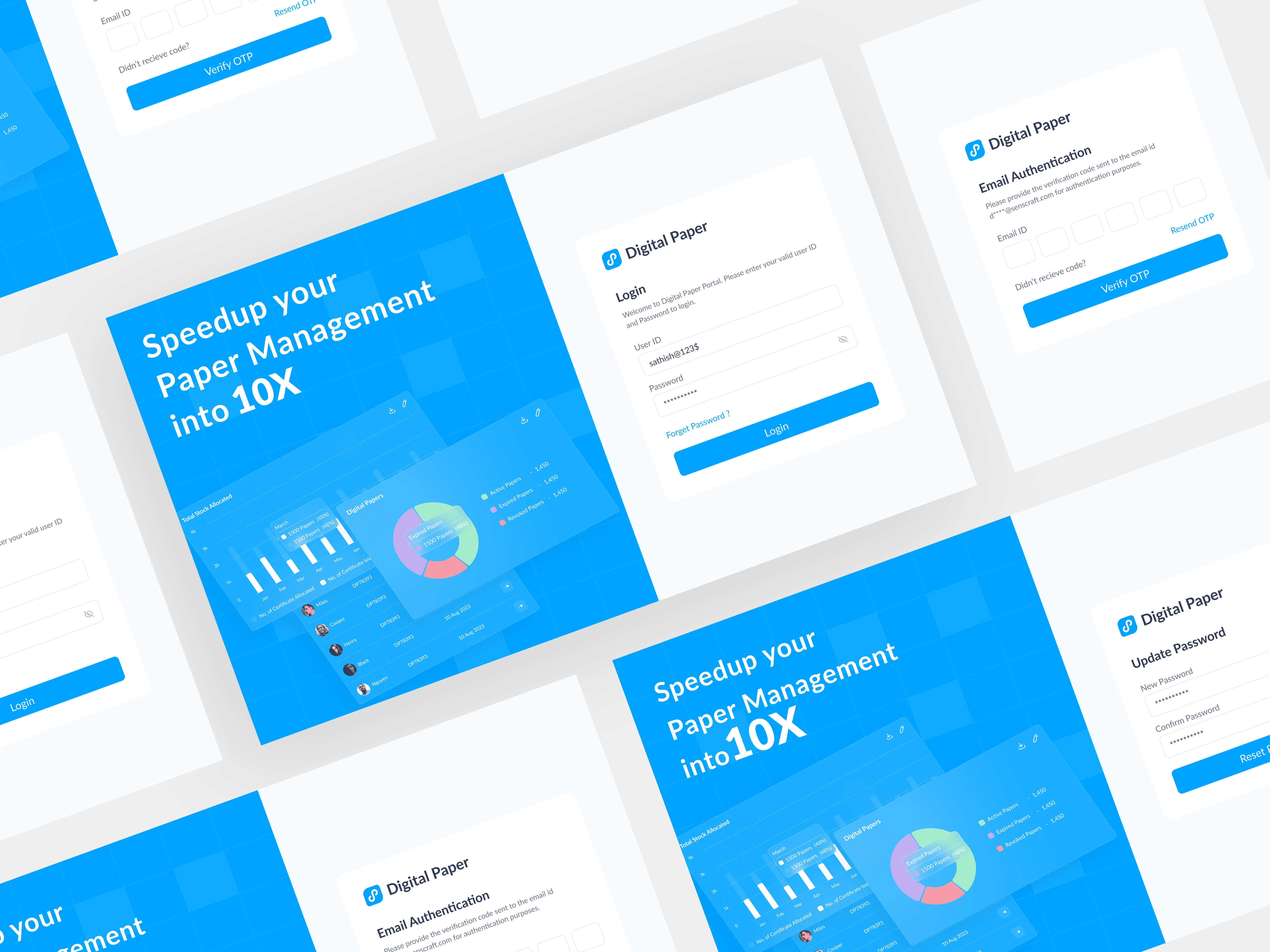
Login Page
A login page is a user interface screen where individuals can access their personal accounts by entering their credentials. It serves as the gateway to a secure area of an application or website.
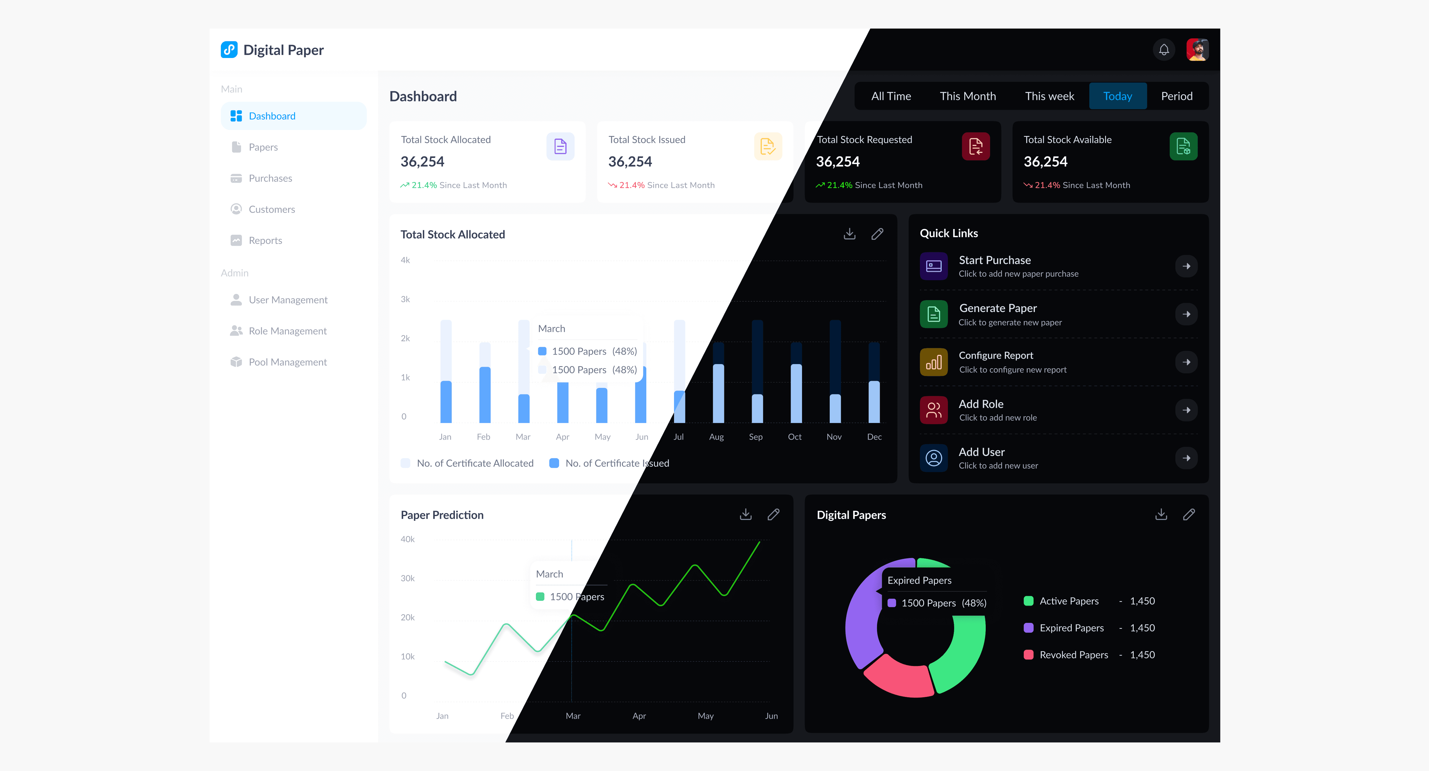
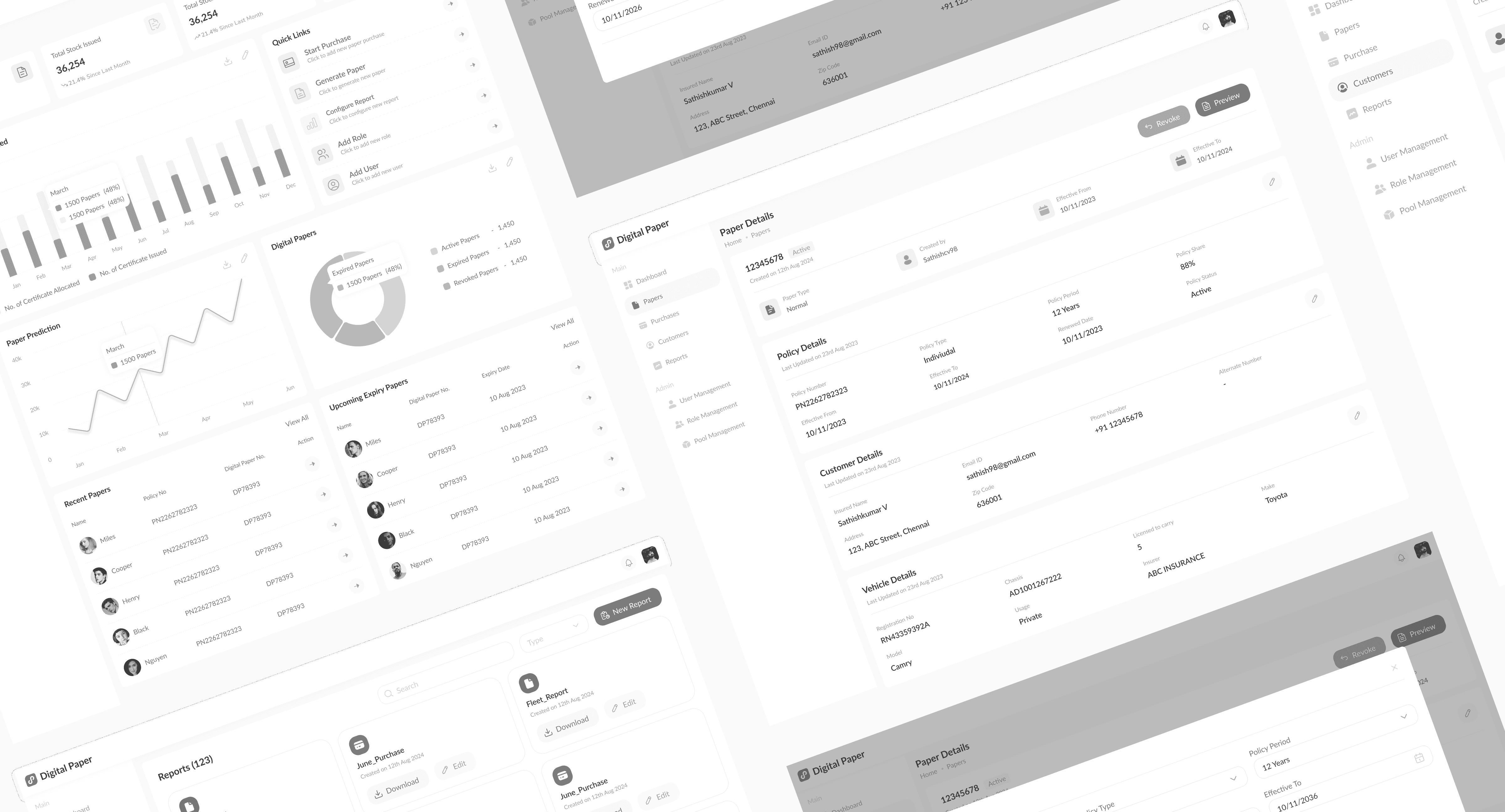
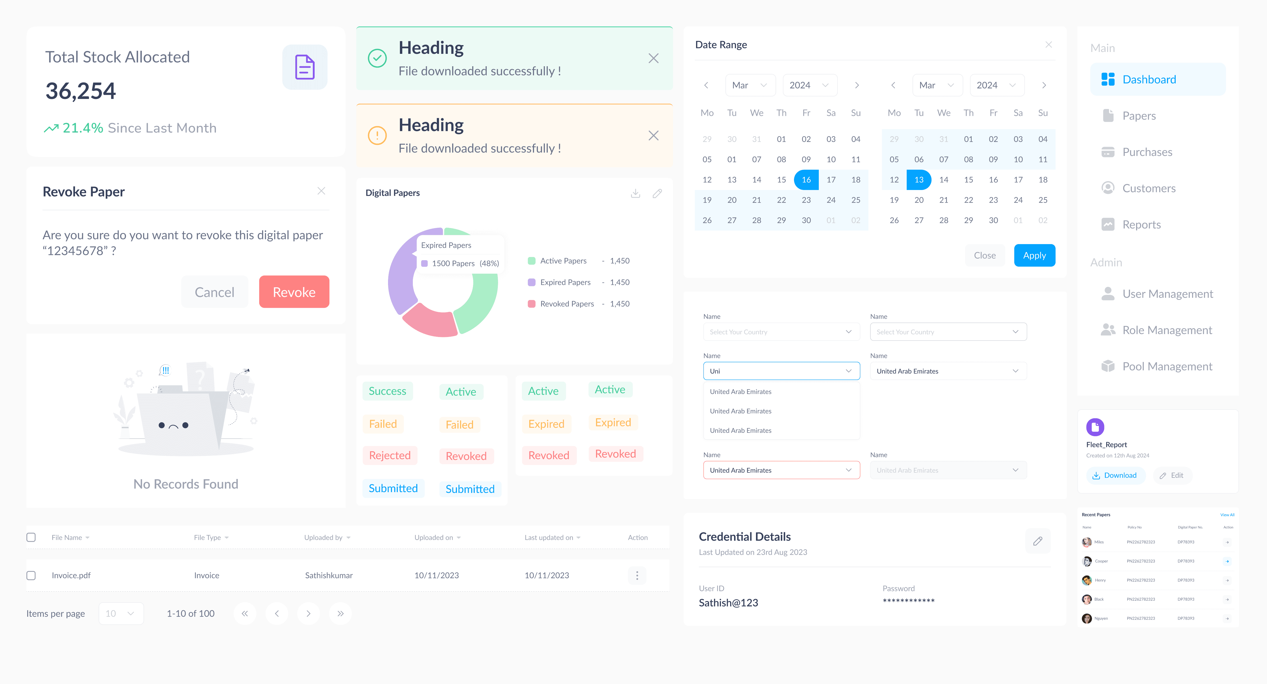
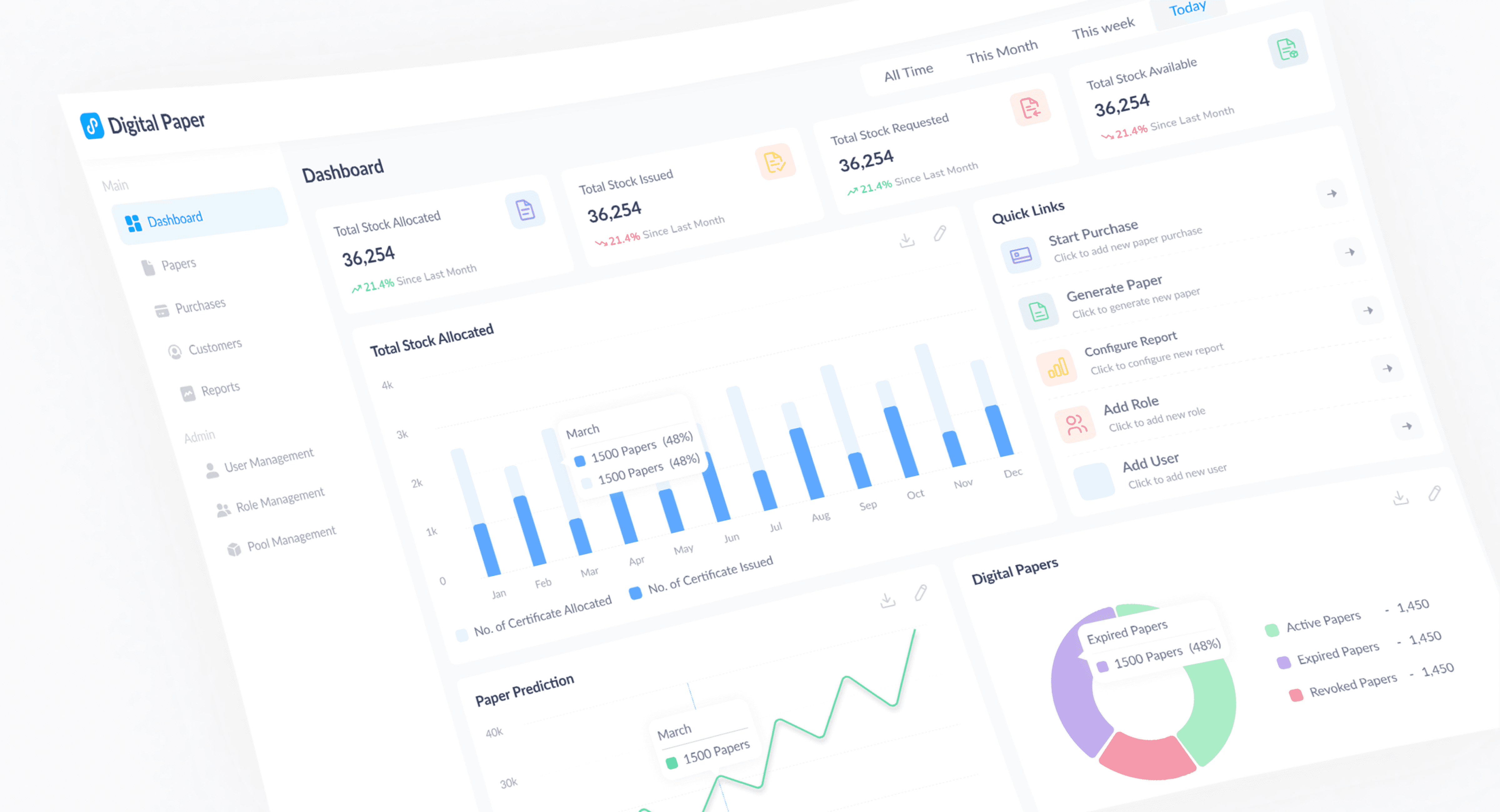
Dashboard
Dashboards with data visualization charts and components are interactive interfaces designed to present complex data in a clear and actionable format. They aggregate and display key metrics, trends, and insights through various visual elements, making it easier for users to interpret and analyze information at a glance.
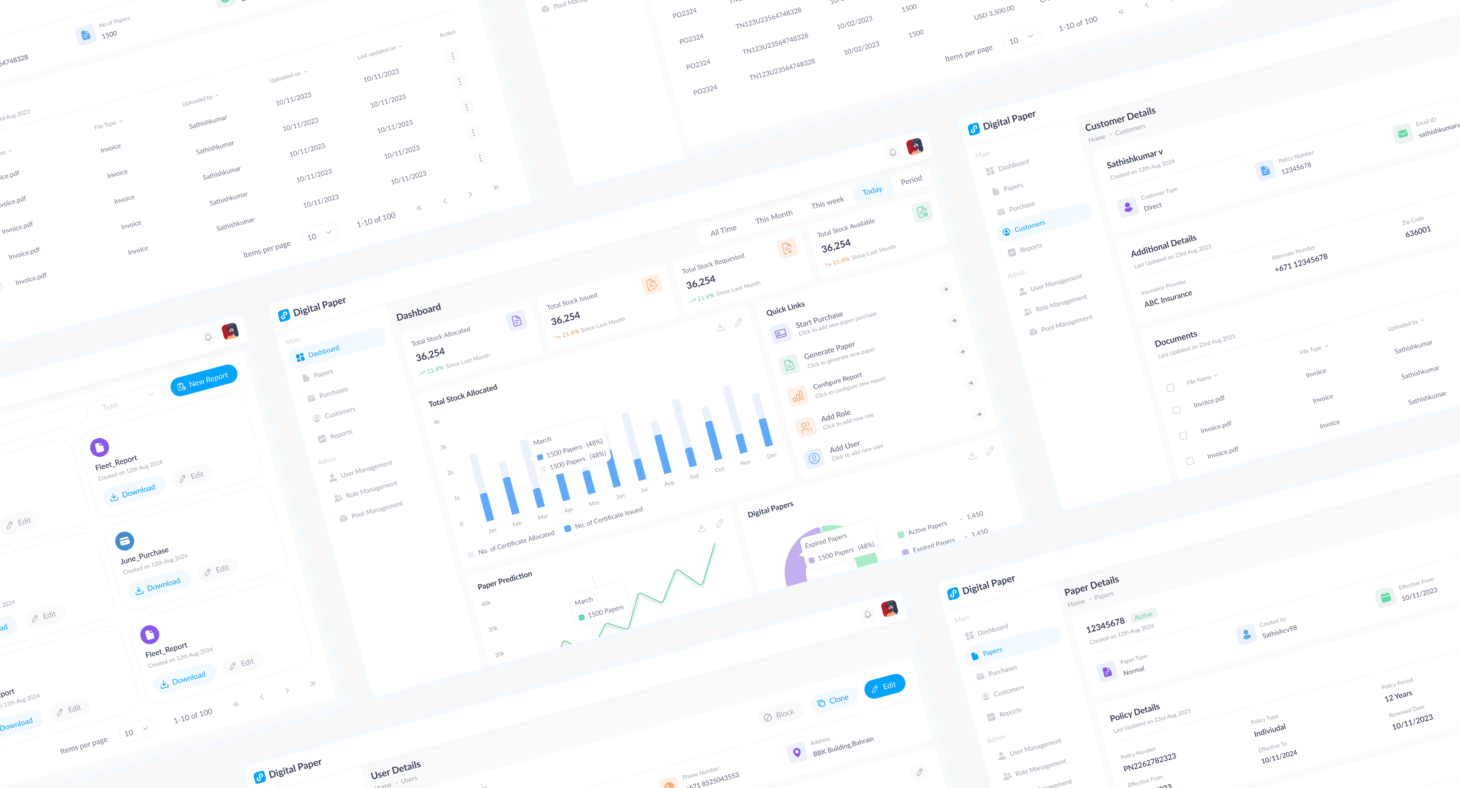
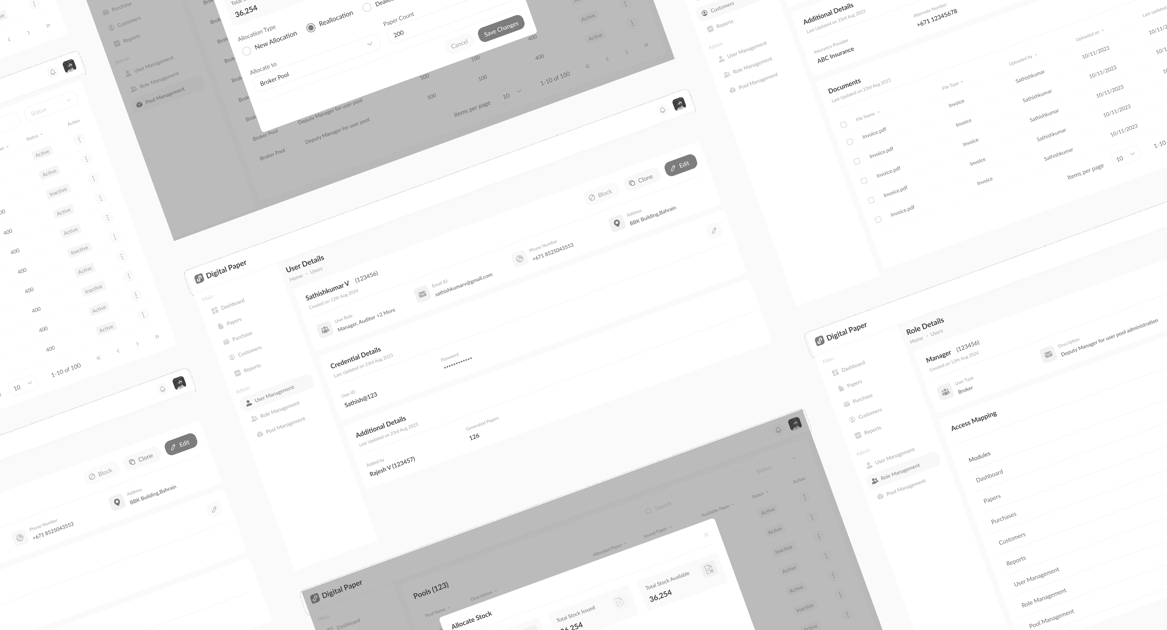
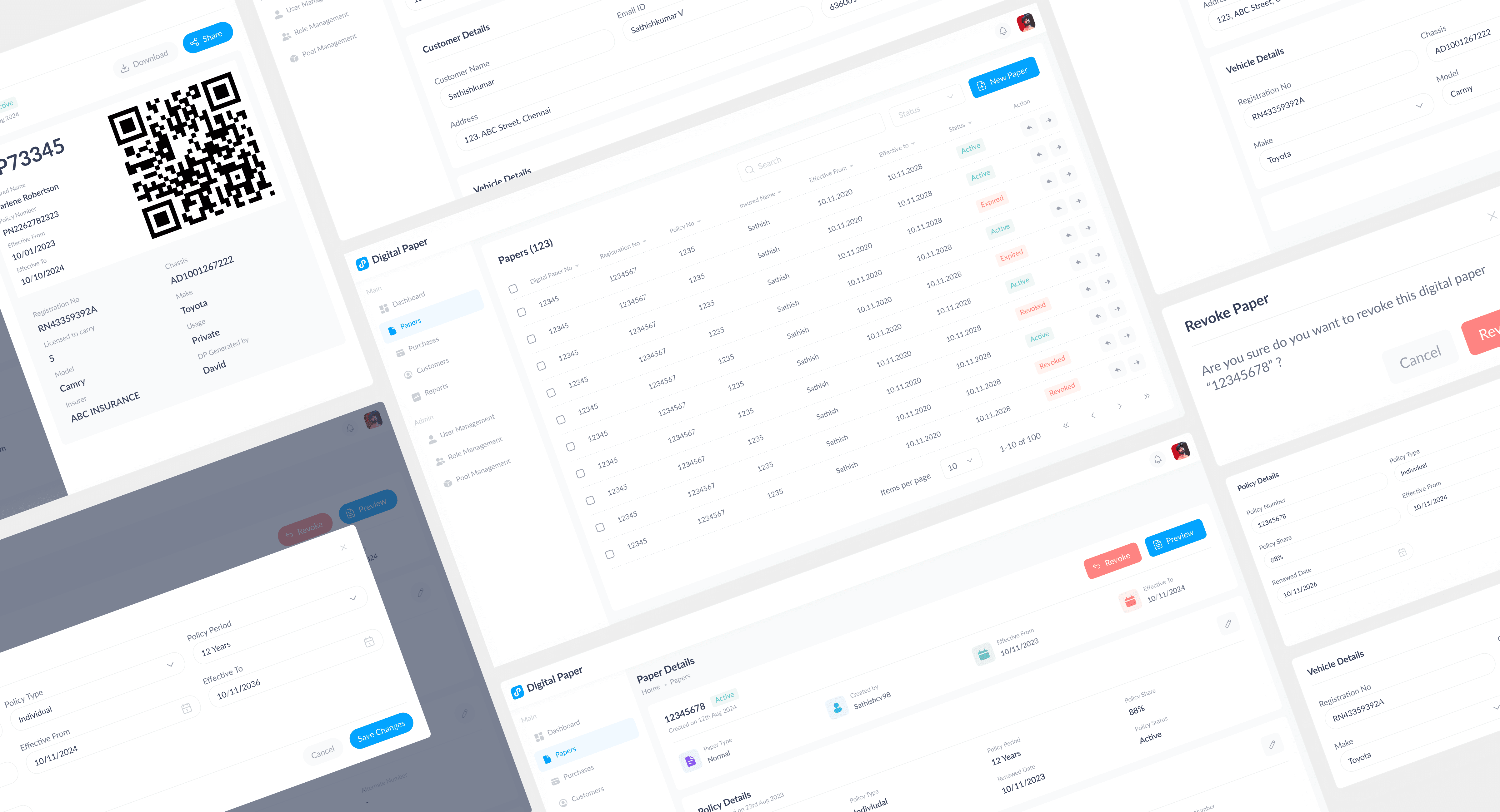
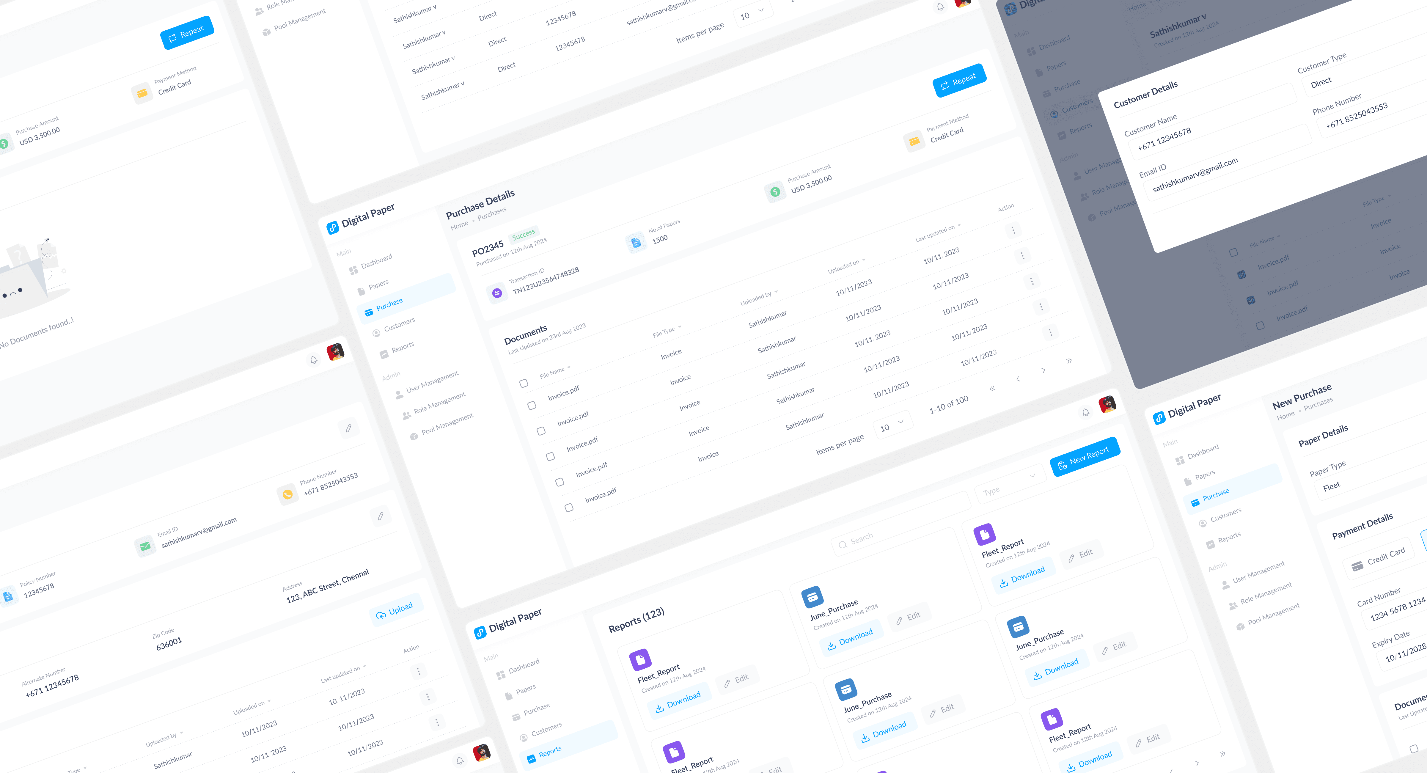
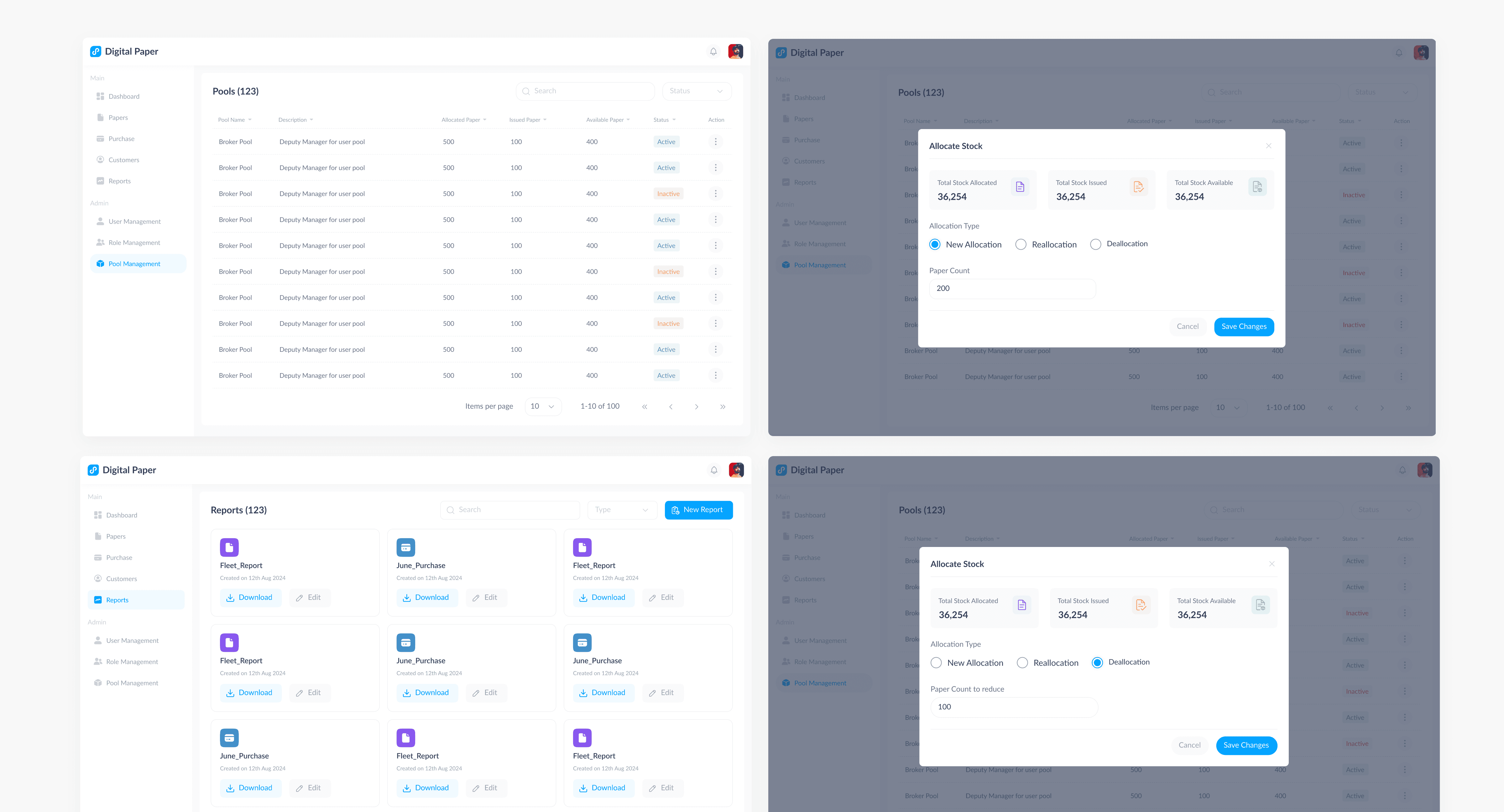
Other Screens
Other screens with enhanced UX and eye-catching UI refer to various interface elements designed to provide an engaging and intuitive user experience. These screens focus on aesthetic appeal and usability, ensuring that interactions are both pleasant and effective.
Dark Mode
Dark Mode and Light Mode are display settings that allow users to choose between different visual themes for their interfaces, enhancing readability and user comfort based on their preferences and environmental conditions.